HIBI
2025
IDENTITY
HIBI is a branding project for a fictional daily-menu Asian restaurant that turns routine lunch into a playful, visual experience. Built around rotation, discovery, and accessibility, it offers a different country-inspired menu each weekday, combining affordability with a joyful identity that brings excitement back to everyday eating. The concept encourages curiosity and repeat visits, transforming everyday meals into small moments of discovery and memorable dining experiences.
HIBI'S IDENTITY IN EVERY DETAIL.
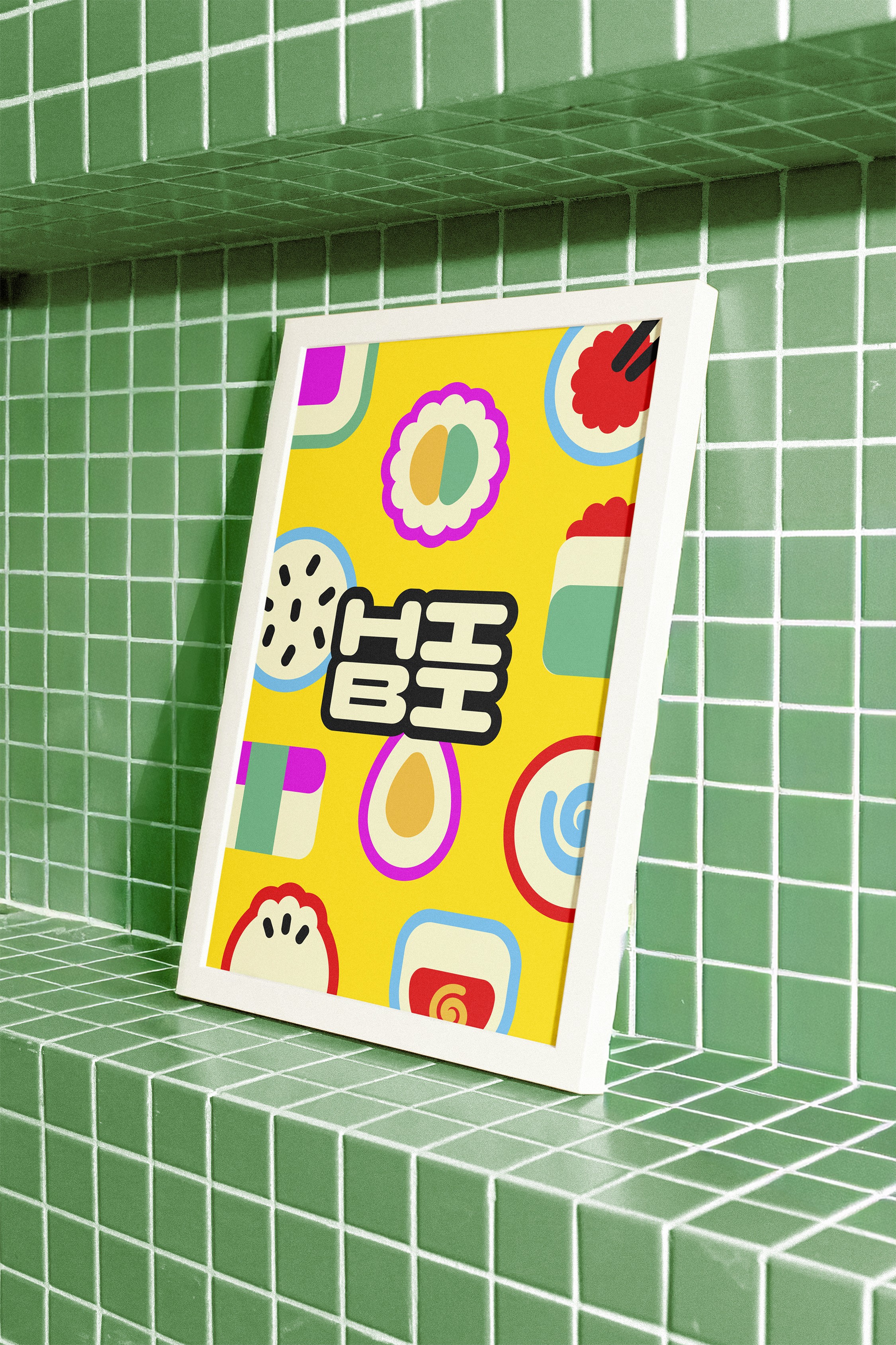
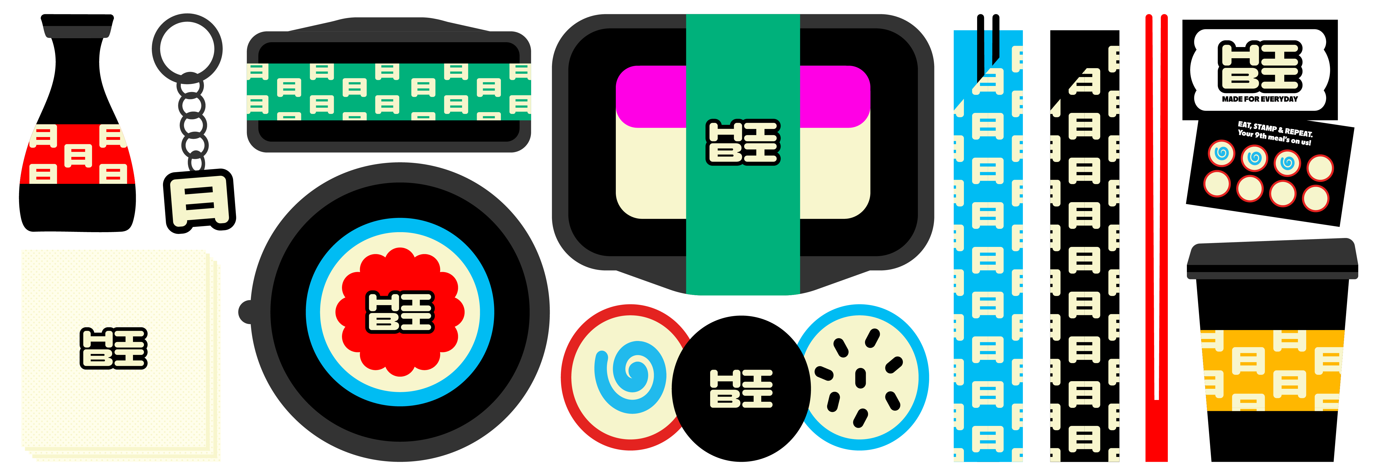
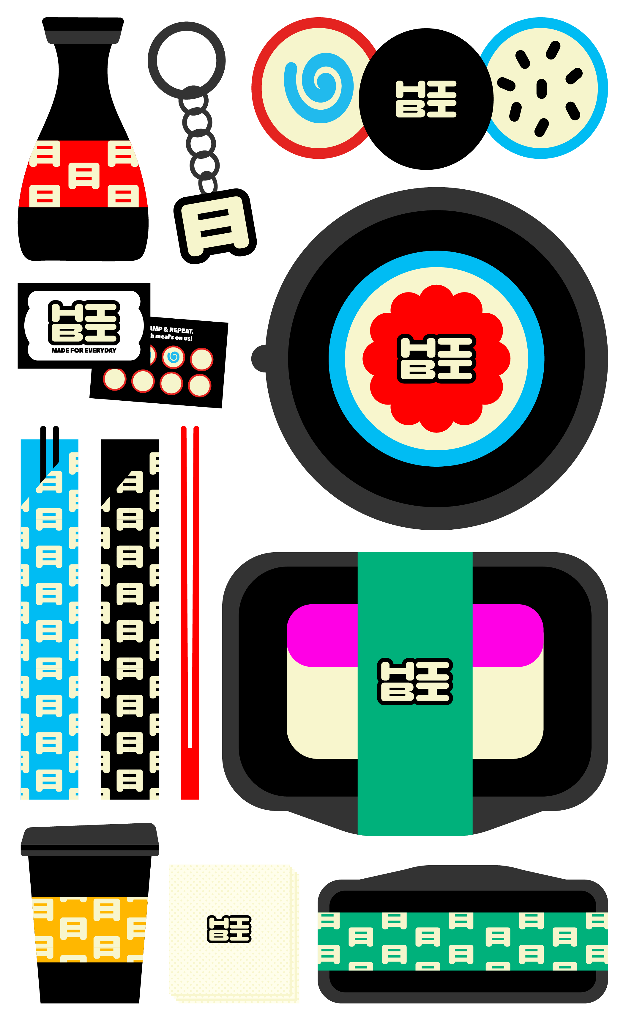
From the logo and color system to menus, packaging, interior graphics, and social media, every element of HIBI has been carefully designed as part of a unified visual system. Each application reinforces the brand’s playful, accessible, and contemporary personality, ensuring that the identity remains consistent across both physical and digital touchpoints. Through detail, HIBI transforms everyday dining into a recognizable and cohesive brand experience. Every surface becomes an opportunity to communicate the concept of daily change and visual rhythm. This attention to detail strengthens brand recognition and turns simple interactions into memorable moments.
NEXT >
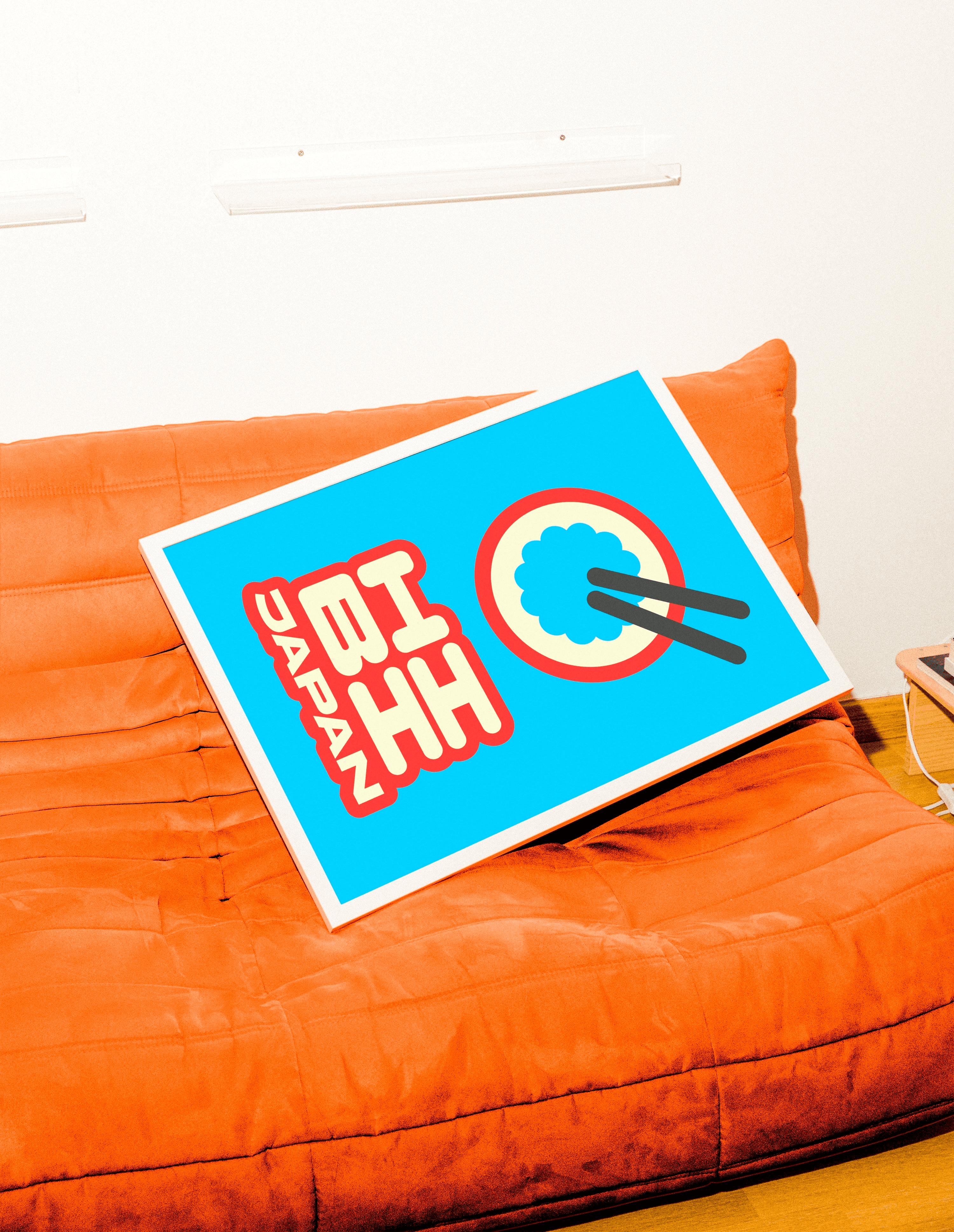
MADE FOR EVERYDAY.
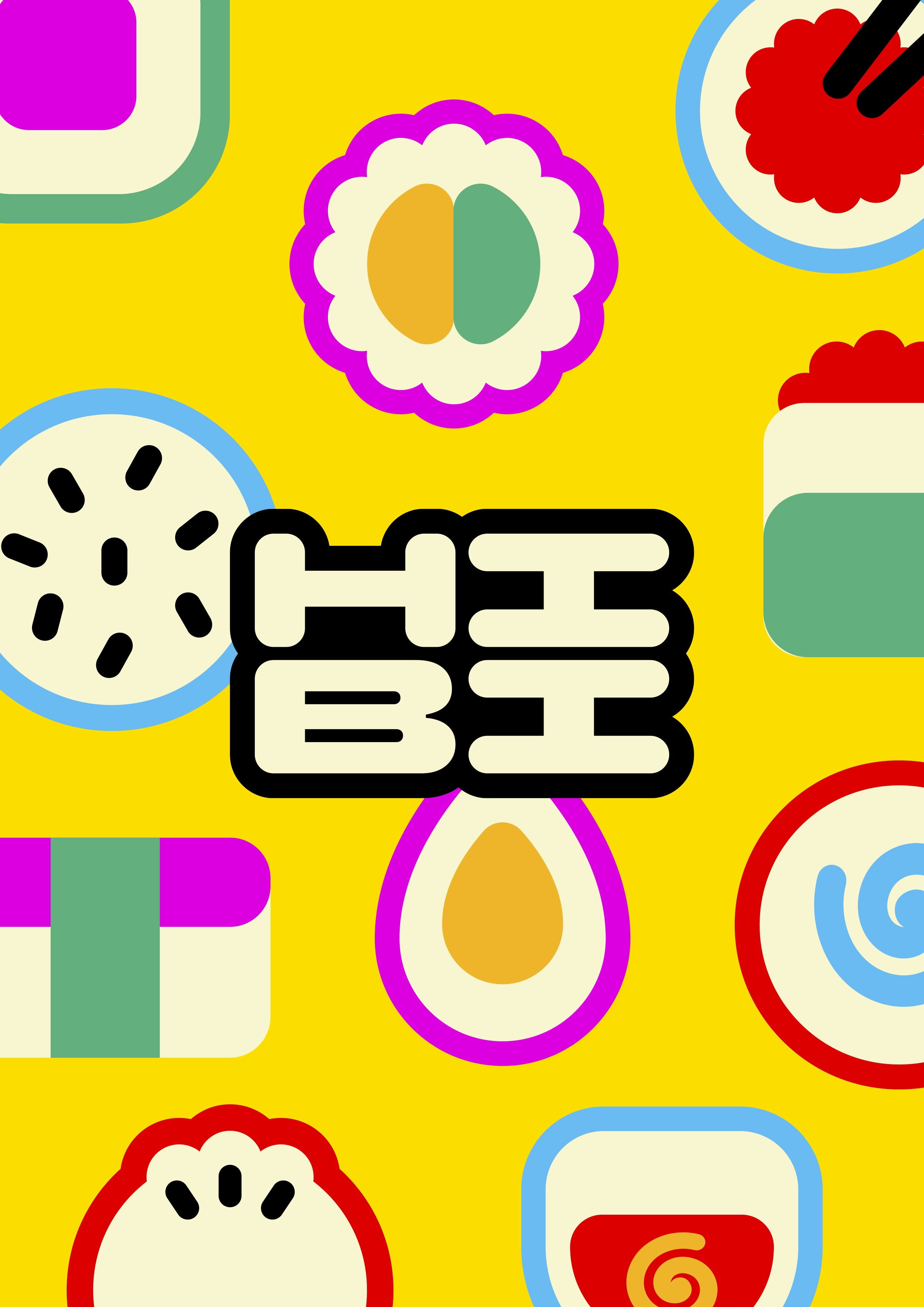
The visual identity is inspired by the Memphis design movement and bold Asian graphics, defined by vibrant colors, geometric shapes, and playful compositions. Color functions as a structural system, assigning a distinct hue to each weekday and country, while black represents the weekend fusion menu. This chromatic rhythm reinforces the idea of daily change and rotation at the core of the brand. The logo is built from a custom typographic composition inspired by the compact structure of Asian characters, later expanded with illustrations and a recurring graphic element based on the Japanese character for “day,” which unifies the system across all applications.

HIBI'S IDENTITY IN EVERY DETAIL.
From the logo and color system to menus, packaging, interior graphics, and social media, every element of HIBI has been carefully designed as part of a unified visual system. Each application reinforces the brand’s playful, accessible, and contemporary personality, ensuring that the identity remains consistent across both physical and digital touchpoints. Through detail, HIBI transforms everyday dining into a recognizable and cohesive brand experience. Every surface becomes an opportunity to communicate the concept of daily change and visual rhythm. This attention to detail strengthens brand recognition and turns simple interactions into memorable moments.
HIBI
HIBI is a branding project for a fictional daily-menu Asian restaurant that turns routine lunch into a playful, visual experience. Built around rotation, discovery, and accessibility, it offers a different country-inspired menu each weekday, combining affordability with a joyful identity that brings excitement back to everyday eating. The concept encourages curiosity and repeat visits, transforming everyday meals into small moments of discovery and memorable dining experiences.
2025
IDENTITY

MADE FOR EVERYDAY.
The visual identity is inspired by the Memphis design movement and bold Asian graphics, defined by vibrant colors, geometric shapes, and playful compositions. Color functions as a structural system, assigning a distinct hue to each weekday and country, while black represents the weekend fusion menu. This chromatic rhythm reinforces the idea of daily change and rotation at the core of the brand. The logo is built from a custom typographic composition inspired by the compact structure of Asian characters, later expanded with illustrations and a recurring graphic element based on the Japanese character for “day,” which unifies the system across all applications.